import ROOT
from array import array
Welcome to JupyROOT 6.24/00import ROOT
from array import arrayWelcome to JupyROOT 6.24/00Orriginally published in 1983, The Visual Display of Quantative Information is a triste on data visualisation. Focusing on the design of plots, graphics, and display rather than on any hands on coding examples.
"This book deals with the theory and practice in the design of data graphics and makes the point that the most effective way to describe, explore, and summarize a set of numbers is to look at pictures of those numbers, through the use of statistical graphics, charts, and tables"
It’s fairly easy to read and should be essential reading for anyone who deals with data.
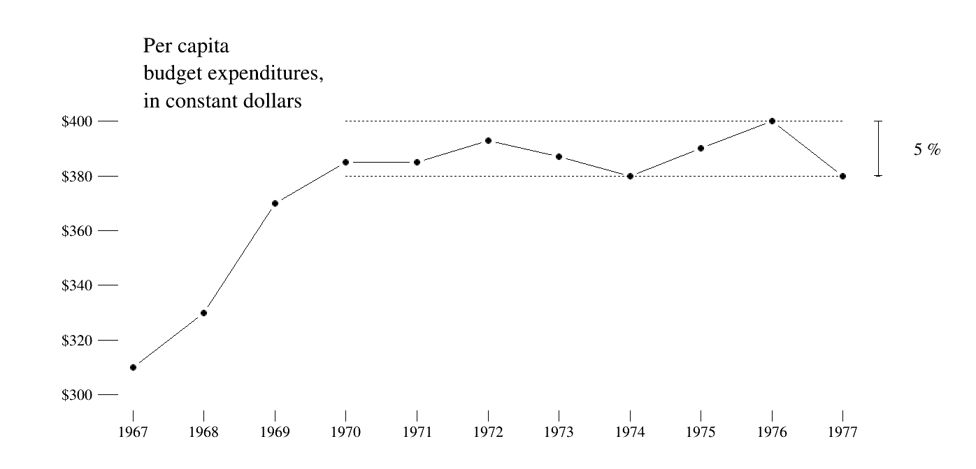
I have chosen a plot that demonstrates many of the key elements of the Tufte design philosophy
The key points to highlight are: - the axis with labels - the minimalist plot style (no lines for axes) - actual data points highlighted - key features emphasised - explaination inline.
There are various elements to discet here, first is the concept of a canvas. In this case a TCanvas which is the base object on which we plot any graphics. The constructor used here specifies the name,title, width, height. Next we have a pad. Ordinarily for a single plot this isn’t necessary as calling a Draw action whilst a canvas is initialised creates a pad (with an associated frame) for you. Here we want to adjust the margins to make sure we can add the Tufte style text adjacent to the plot, so we specify the plot explicitly. The constructor used here is name,title,x_min,y_min,x_max,y_max. If we wanted subplots we would define multiple Pads and set each active with a cd() command. The pad here takes up the entirety of the canvas as the x and y values specify decimal fractions of the canvas. 20% of the canvas height is set aside for the overflowing text. Finally we create a frame object that covers the values that we would like to plot, and finally call c.Draw() to display the canvas.
#make the canvas
c = ROOT.TCanvas("c","c", 1400, 700)

pad = ROOT.TPad("p","p",0,0,1,1, 0)
pad.Draw()
pad.cd()
pad.SetFrameLineColor(0)
pad.SetTopMargin(.2)
frame = pad.DrawFrame(1966.5, 290,1977.5,410)
c.Draw()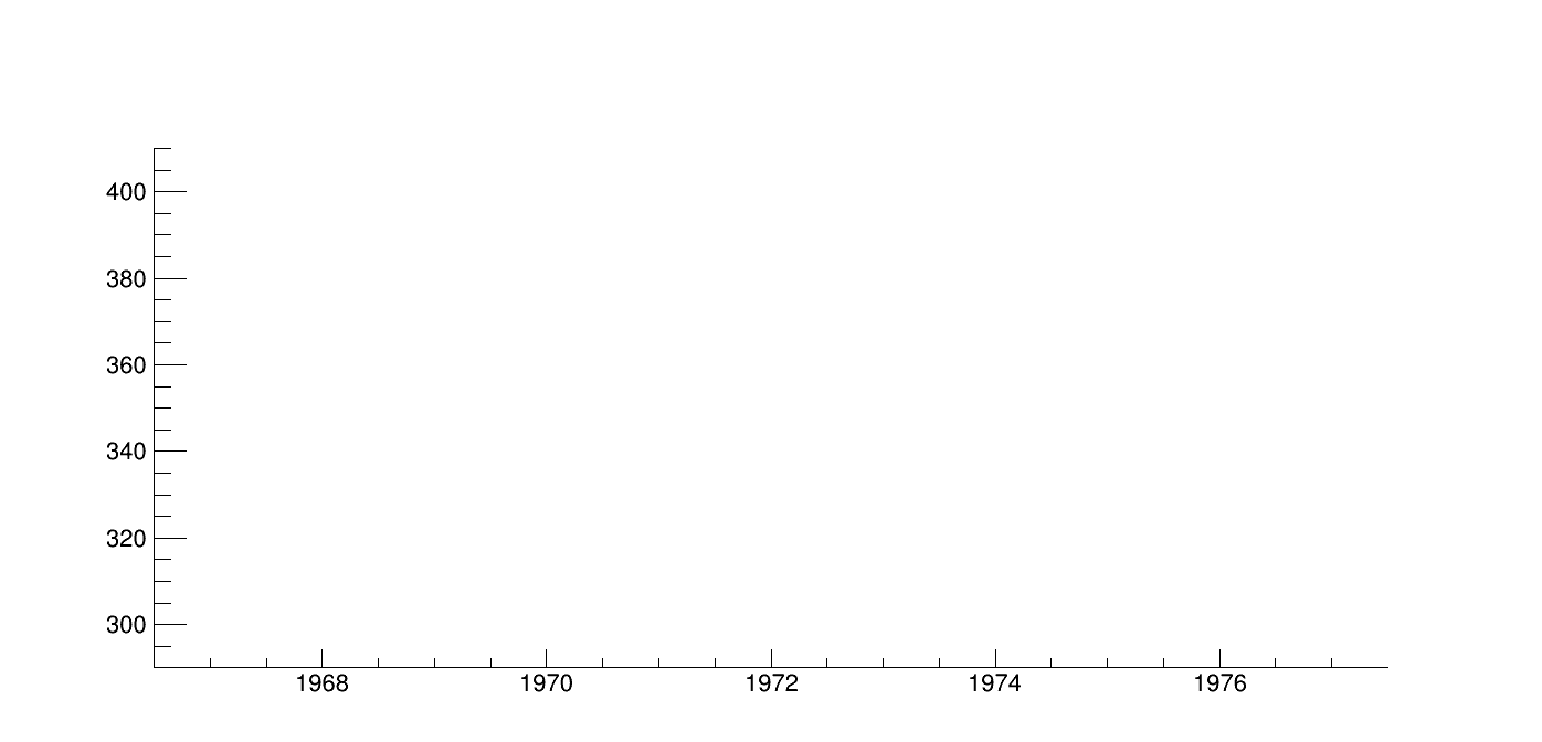
Next we would like to set the number of ticks to be equal to the number of data points (one of Tufte’s principles - ” The representation of numbers, as physically measured on the surface of the graphic itself, should be directly proportional to the numerical quantities represented “) and perform some cosmetics like setting the font, adding the dollar sign, and removing the black line on the axis.
#set the axis style!
xaxis = frame.GetXaxis();
yaxis = frame.GetYaxis();

xaxis.SetLabelFont(132);
yaxis.SetLabelFont(132);

xaxis.SetNdivisions(11);
yaxis.SetNdivisions(10);
yaxis.ChangeLabel(1,-1,-1,-1,-1,-1,"$300");
yaxis.ChangeLabel(2,-1,-1,-1,-1,-1,"$320");
yaxis.ChangeLabel(3,-1,-1,-1,-1,-1,"$340");
yaxis.ChangeLabel(4,-1,-1,-1,-1,-1,"$360");
yaxis.ChangeLabel(5,-1,-1,-1,-1,-1,"$380");
yaxis.ChangeLabel(6,-1,-1,-1,-1,-1,"$400");

# Draw a white line over the axis bar
l = ROOT.TLine()
l.SetLineColor(ROOT.kWhite)
l.DrawLine(1966.5, 290,1966.5,410)
l.DrawLine(1966.5, 290,1977.5,290)
c.Draw()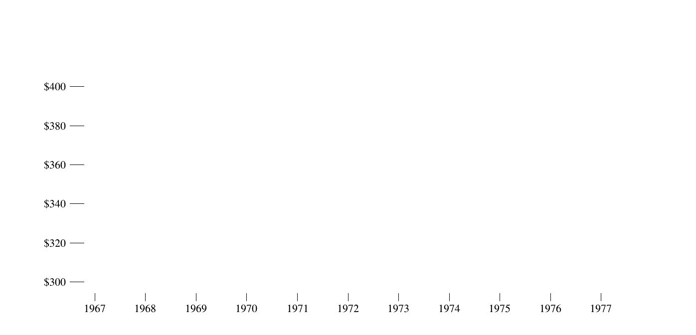
This part is the easy part. We plot the data 3 times: once with lines connecting the points to highlight data variation, once with large white dots to interupt the lines in order to clarify which points are data, and then the data itself. In ROOT we need only to define the TGraph object once with the constructor n points, array of x points, array of y points. Often in physics we would like to also plot errors which also require overlaying of TGraphs and TGraphErrors.
#define some data
x = list(range(1967, 1978))
y = [310, 330, 370, 385, 385, 393, 387, 380, 390, 400, 380]
n = len(x)

## Now add the data.
# Making the graph first.
gr = ROOT.TGraph(n,array('d',x),array('d',y))
gr.SetMarkerStyle(20)

# adding the connecting line
gr_line = gr.Clone()
gr.Draw("L")

# adding white dots to highlight the data points
gr_white = gr.Clone()
gr_white.SetMarkerSize(2.5)
gr_white.SetMarkerColor(0)
gr_white.Draw("P")

# and the actual datapoints
gr.Draw("P")
c.Draw()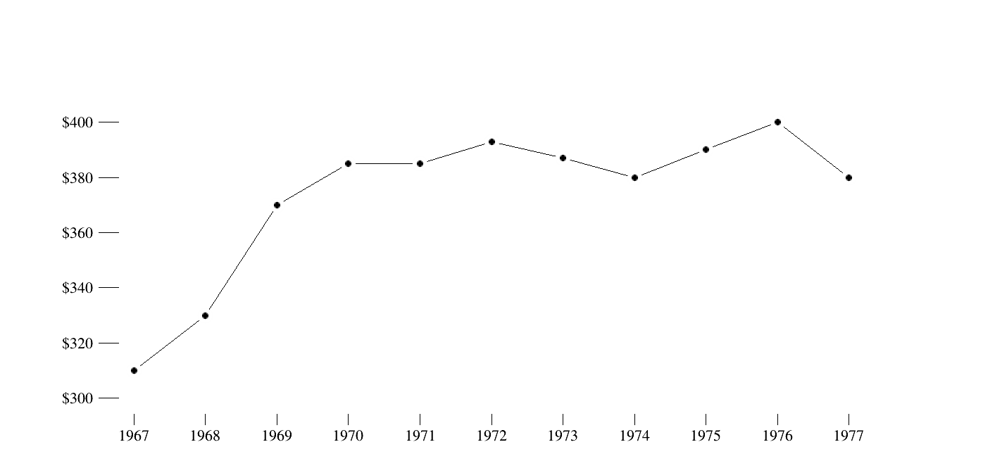
In the above plot we have covered three key points from Tufte, represent the data not the plot, Maximise the data-ink ratio, and show data variation not design. Finally we should label the important events in the data and explain the quantities.
We do this in three ways. An annotation explaining the plot (this could also be a caption or in the title), two lines highlighting how much of the data falls within a small variation, and a label to explain that highlight.
## Now text and highlights
#dotted line first
l2 = ROOT.TLine()
l2.SetLineStyle(2)
l2.DrawLine(1970, 380, 1977, 380)
l2.DrawLine(1970, 400, 1977, 400)

#arrow between the 5% bars
ar = ROOT.TArrow(1977.5, 380 ,1977.5, 400, 0.01, "<|>")
ar.SetAngle(178)
ar.SetArrowSize(.0001)
ar.Draw()
five = ROOT.TText(1978, 387.5, "5 %")
five.SetTextFont(132)
five.SetTextSize(.04)
five.Draw()

#and the text
title_text = ROOT.TPaveText(1967, 430, 1970, 400)
title_text.SetTextAlign(11)
title_text.SetTextFont(132)
title_text.SetFillColor(0)
title_text.SetBorderSize(0)
title_text.AddText("Per capita")
title_text.AddText("budget expenditures,")
title_text.AddText("in constant dollars")
title_text.Draw()
c.Draw()
Here is the example in a fully standalone example.
import ROOT
from array import array

#define some data
x = list(range(1967, 1978))
y = [310, 330, 370, 385, 385, 393, 387, 380, 390, 400, 380]
n = len(x)

#make the canvas
c = ROOT.TCanvas("c","c", 1400, 700)

pad = ROOT.TPad("p","p",0,0,1,1, 0)
pad.Draw()
pad.cd()
pad.SetFrameLineColor(0);
pad.SetTopMargin(.2)
frame = pad.DrawFrame(1966.5, 290,1977.5,410);

#set the axis style!
xaxis = frame.GetXaxis();
yaxis = frame.GetYaxis();

xaxis.SetLabelFont(132);
yaxis.SetLabelFont(132);

xaxis.SetNdivisions(11);
yaxis.SetNdivisions(10);
yaxis.ChangeLabel(1,-1,-1,-1,-1,-1,"$300");
yaxis.ChangeLabel(2,-1,-1,-1,-1,-1,"$320");
yaxis.ChangeLabel(3,-1,-1,-1,-1,-1,"$340");
yaxis.ChangeLabel(4,-1,-1,-1,-1,-1,"$360");
yaxis.ChangeLabel(5,-1,-1,-1,-1,-1,"$380");
yaxis.ChangeLabel(6,-1,-1,-1,-1,-1,"$400");

# Draw a white line over the axis bar
l = ROOT.TLine()
l.SetLineColor(ROOT.kWhite)
l.DrawLine(1966.5, 290,1966.5,410)
l.DrawLine(1966.5, 290,1977.5,290)

## Now add the data.
# Making the graph first.
gr = ROOT.TGraph(n,array('d',x),array('d',y))
gr.SetMarkerStyle(20)

# adding the connecting line
gr_line = gr.Clone()
gr.Draw("L")

# adding white dots to highlight the data points
gr_white = gr.Clone()
gr_white.SetMarkerSize(2.5)
gr_white.SetMarkerColor(0)
gr_white.Draw("P")

# and the actual datapoints
gr.Draw("P")

## Now text and highlights
#dotted line first
l2 = ROOT.TLine()
l2.SetLineStyle(2)
l2.DrawLine(1970, 380, 1977, 380)
l2.DrawLine(1970, 400, 1977, 400)

#arrow between the 5% bars
ar = ROOT.TArrow(1977.5, 380 ,1977.5, 400, 0.01, "<|>")
ar.SetAngle(178)
ar.SetArrowSize(.0001)
ar.Draw()
five = ROOT.TText(1978, 387.5, "5 %")
five.SetTextFont(132)
five.SetTextSize(.04)
five.Draw()

#and the text
title_text = ROOT.TPaveText(1967, 430, 1970, 400)
title_text.SetTextAlign(11)
title_text.SetTextFont(132)
title_text.SetFillColor(0)
title_text.SetBorderSize(0)
title_text.AddText("Per capita")
title_text.AddText("budget expenditures,")
title_text.AddText("in constant dollars")
title_text.Draw()
c.Draw()
c.SaveAs("tufte_root.png")
Welcome to JupyROOT 6.24/00Info in <TCanvas::Print>: png file tufte_root.png has been created