import numpy as np
import matplotlib.pyplot as plt
import matplotlib.ticker as ticker
import seaborn as sns

import pandas as pd
import geopandas as gpd

import scipy.stats as stats
import tensorflow_probability as tfp
tfd, tfb, tfmcmc = tfp.distributions, tfp.bijectors, tfp.mcmc
import tensorflow as tf
tf.keras.backend.set_floatx('float32')
tf.config.experimental.enable_tensor_float_32_execution(False)
np.random.seed(666)When Small Samples Meet Big Decisions: The Art of Borrowing Statistical Strength
It’s one of the fundamental tasks for anyone starting a new project in data science, what does my data show? There’s two approaches, look at relationships between variables or split the data up to focus more on the details. But imagine that you are tasked with estimating the average income in every neighborhood of a large city. Some neighborhoods have thousands of responses, while others have just a handful. Do you trust those ten responses from the waterfront district that suggest millionaire-level average incomes? Or when a small sample from the university area shows suspiciously low earnings? This is the fundamental challenge that sends statisticians reaching for a powerful tool: borrowing strength from related data.
The problem is deceptively simple but maddeningly common. When we divide our data into smaller and smaller groups—whether neighborhoods, demographic categories, or time periods—we eventually hit a wall. Each slice becomes too thin to provide reliable estimates. The standard statistical approach of calculating an average and standard error works beautifully with hundreds of observations, but becomes almost useless with just ten or twenty. The error bars explode, the estimates swing wildly, and decision-makers are left with numbers they can’t trust.
This challenge appears everywhere important decisions are made. Government agencies need unemployment rates for small counties to allocate job training funds. Public health officials need disease rates in rural communities to plan interventions. Schools need test score estimates for small student subgroups to comply with education laws. In each case, the stakes are high, the data is limited, and traditional statistics falls short.
The breakthrough insight is that these small groups don’t exist in isolation. That waterfront neighborhood shares characteristics with other wealthy areas. The university district resembles other student-heavy zones. While each area is unique, they’re not completely unique. This observation opens a door: what if we could somehow use information from similar areas to improve our estimates, without assuming all areas are identical?
This is precisely what “partial pooling” or “shrinkage estimation” accomplishes. Instead of treating each small group as either completely unique (analyzing it in isolation) or completely typical (lumping it with everyone else), we take a middle path. We pull suspicious-looking estimates toward the overall average, but not all the way. The amount of pulling depends on how suspicious the estimate looks and how confident we are in it.
The magic lies in how we define “suspicious.” An extreme estimate from a tiny sample is highly suspicious—it’s probably noise rather than signal. But the same extreme value from a large sample is credible—it likely reflects a real difference. The mathematical framework quantifies this intuition: estimates get pulled toward the group average in proportion to their uncertainty. Areas with lots of data barely budge. Areas with minimal data get yanked strongly toward the center.
This approach, formalized in models like the Fay-Herriot model we’ll explore below, delivers something remarkable: estimates that are both more accurate and more honest about their uncertainty. By acknowledging that extreme values in small samples are usually mirages, we get closer to the truth. By borrowing information from related groups, we squeeze more insight from limited data. It’s not magic—it’s the statistical equivalent of asking for a second opinion when the first one seems questionable.
Dummy data: When Noise Masquerades as Signal
Let’s create a controlled experiment to see this problem in action. We’ll simulate ten different regions, each with a true average value drawn from a bell curve centered at 0.5. From each region, we take just ten observations. When we calculate the direct estimates from these small samples, something troubling emerges: some regions appear significantly different from the overall average, even when we know they were all drawn from similar distributions.
means = np.random.normal(0.5, 0.1,10)
subsets = [np.random.normal(means[i], 0.3, 10) for i in range(10)]

fig,ax = plt.subplots(1,3,figsize=(15,5))

for i in range(10):
    sub_est = np.mean(np.array(subsets)[i])
    ax[0].hist(np.array(subsets)[:i].flatten(),np.linspace(-0,1.5,10),histtype="step",label=r"$\mu$="+"{:.2f}".format(means[i])+r", $\hat{\mu}=$"+"{:.2f}".format(sub_est));
ax[0].legend()

y = np.arange(10)
ax[1].errorbar(np.mean(subsets,axis=1),y,xerr=1.96*np.std(subsets,axis=1)/np.sqrt(10), fmt="o",capsize=3,label="subset estimate")
ax[1].axvline(np.mean(np.array(subsets).flatten()), linestyle="--",label= "population mean")
ax[1].legend()
ax[1].set_xlim(.1,1.1)

z_stats = np.abs(np.array([np.mean(s) for s in subsets]) - np.mean(np.array(subsets).flatten())) / np.array([np.std(s)/np.sqrt(10) for s in subsets])
p_direct = 2 * (1 - stats.norm.cdf(z_stats))
ax[2].axvline(.05, linestyle="--",label= "p=0.05")
ax[2].barh(y,p_direct);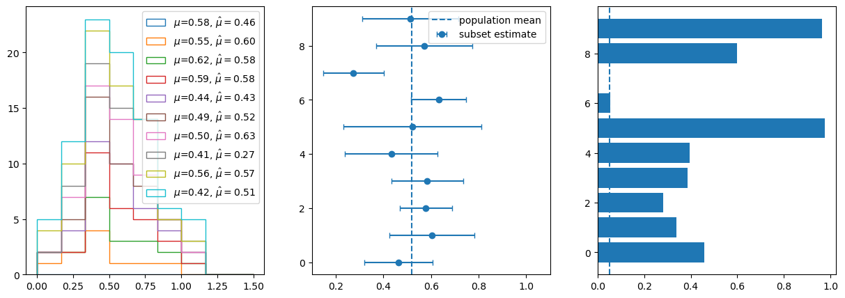
The third panel in our visualization reveals the statistical trap. Those p-values, testing whether each region differs from the global mean, may often fall below the conventional 0.05 threshold. We’re presenting results, we may be tempted to present results showing that regions are “significantly different” based on noise, not real differences. With small samples, random variation gets misinterpreted as meaningful patterns. This is the multiple testing problem compounded by small sample sizes—we’re almost guaranteed to find spurious “significant” differences if we look at enough small groups.
The Fay-Herriot Solution
The mathematics of the Fay-Herriot model elegantly addresses this problem through optimal weighting. For each region i, instead of using the direct estimate \(\hat{\theta}_i\) with its standard error \(SE_i\), we calculate a weighted average:
\[\theta_i^{FH} = w_i \cdot \hat{\theta}_i + (1-w_i) \cdot \bar{\theta}\]
where \(\bar{\theta}\) is the global mean and the weight is:
\[w_i = \frac{\tau^2}{\tau^2 + SE_i^2}\]
Here, \(\tau^2\) represents the true variance between regions—how much real differences exist versus sampling noise. When a region’s sampling error (\(SE_i^2\)) is large relative to the between-region variance (\(\tau^2\)), the weight \(w_i\) shrinks toward zero, pulling that region’s estimate toward the global mean. Conversely, regions with precise estimates (small \(SE_i\)) maintain weights close to one, staying near their direct estimates.
The posterior variance of these new estimates also shrinks: \(Var(\theta_i^{FH}) = w_i \cdot SE_i^2\), always smaller than the original variance. We get estimates that are both closer to the truth and more precise—a statistical win-win.
# Calculate direct estimates and their SEs
direct_estimates = np.array([np.mean(s) for s in subsets])
direct_ses = np.array([np.std(s)/np.sqrt(10) for s in subsets])

# Simple pooled estimate (ignore area differences)
pooled_estimate = np.mean(np.concatenate(subsets))
pooled_ses = np.std(np.concatenate(subsets))/np.sqrt(100)

# Fay-Herriot compromise: weighted average based on precision
# Weight = 1/(SE^2 + tau^2) where tau^2 is between-area variance
tau2 = np.var(direct_estimates) - np.mean(direct_ses**2)  # Simple moment estimator
tau2 = max(0, tau2)  # Ensure non-negative

weights = tau2 / (direct_ses**2 + tau2)
fh_estimates = (weights * direct_estimates + (1-weights) * pooled_estimate)
fh_variance = (direct_ses**2 * tau2) / (direct_ses**2 + tau2)
fh_ses = np.sqrt(fh_variance)

# Visualization
fig, axes = plt.subplots(1, 3, figsize=(15, 5))

ax = axes[0]
x = np.arange(10)
ax.errorbar(x, direct_estimates, yerr=1.96*direct_ses, fmt='o', capsize=5, alpha=0.6, label='Direct estimates (95% CI)')
ax.scatter(x, means, color='red', marker='x', s=100, label='True values')
ax.axhline(pooled_estimate, color='green', linestyle='--', alpha=0.5, label='Pooled estimate')
ax.set_title('The Problem: Small Samples = Noisy Estimates')
ax.legend()

ax = axes[1]
width = 0.25
ax.errorbar(x, direct_estimates, yerr=1.96*direct_ses, fmt='o', capsize=5, alpha=0.6, label='Direct estimates (95% CI)')
ax.errorbar(x, fh_estimates, yerr=1.96*fh_ses, fmt='o', capsize=5, alpha=0.6, label='Fay-Herriot (partial pooling) (95% CI)')
ax.fill_between([x[0]-2*width,x[-1]+2*width],pooled_estimate-pooled_ses,pooled_estimate+pooled_ses, color='green', alpha=0.25)
ax.axhline(pooled_estimate, color='green', linestyle='--', alpha=0.5, label='Pooled estimate')
ax.set_xlim(-.25,9.25)
ax.set_title('Three Approaches to Small Area Estimation')
ax.legend()

ax = axes[2]
ax.set_ylabel('p-value')
ax.set_title('Significance of an subset estimate')
z_stats = np.abs(fh_estimates - pooled_estimate) / fh_ses
p_fh = 2 * (1 - stats.norm.cdf(z_stats))
ax.bar(y+.5*width,p_fh,width,label='FH-estimate')
ax.bar(y-.5*width,p_direct,width,label='direct')
ax.legend()

plt.tight_layout()
plt.show()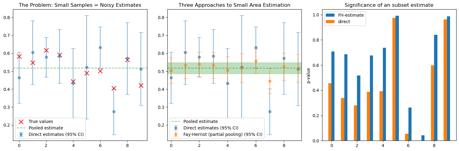
Here we compare all three approaches side by side. The direct estimates jump erratically, the pooled estimate ignores all regional variation, but the Fay-Herriot estimates find the sweet spot. They track closer to the true values than either extreme approach. Regions with reliable data stay distinct, while those with noisy estimates get pulled toward safety. The partial pooling adapts to the reliability of each piece of information.
Real-World Application: Occupational Wages Across America
This analysis builds on the work by Ben Schneider in his blog post but reimplements everything in Python using TensorFlow Probability as this is much more familiar to data scientists working in the Python ecosystem.
The Bureau of Labor Statistics (BLS) faces exactly the challenge we’ve been discussing. They need to estimate average wages for hundreds of detailed occupations across hundreds of metropolitan areas—creating tens of thousands of occupation-by-city combinations. Some of these are well-populated (think “registered nurses in New York City”) while others are sparse (“nuclear engineers in Anchorage”). Yet policy makers, job seekers, and businesses need reliable wage estimates for all these combinations, not just the common ones.
The BLS publishes these estimates through their Occupational Employment and Wage Statistics (OEWS) program, providing both the wage estimates and their percent relative standard errors (PRSE)—essentially a quality score for each number. When the PRSE is low (say, under 5%), we can trust the estimate. When it climbs above 10% or 15%, we’re looking at increasingly noisy data. The BLS won’t even publish estimates with PRSEs above 30%, recognizing they’re too unreliable to be useful.
bls = pd.read_excel('./MSA_M2020_dl.xlsx')
bls = bls[['AREA','AREA_TITLE','O_GROUP','OCC_CODE','OCC_TITLE','TOT_EMP','EMP_PRSE','A_MEAN','MEAN_PRSE']] # drop superflous columns
# cast any column with 'EMP' or 'MEAN' in the name to numeric
cols = bls.filter(regex=r'(EMP|MEAN)').columns
bls[cols] = bls[cols].apply(pd.to_numeric, errors='coerce')
# compute standard errors
bls['TOT_EMP_SE'] = (bls['EMP_PRSE'] / 100.0) * bls['TOT_EMP']
bls['A_MEAN_WAGE_SE'] = (bls['MEAN_PRSE'] / 100.0) * bls['A_MEAN']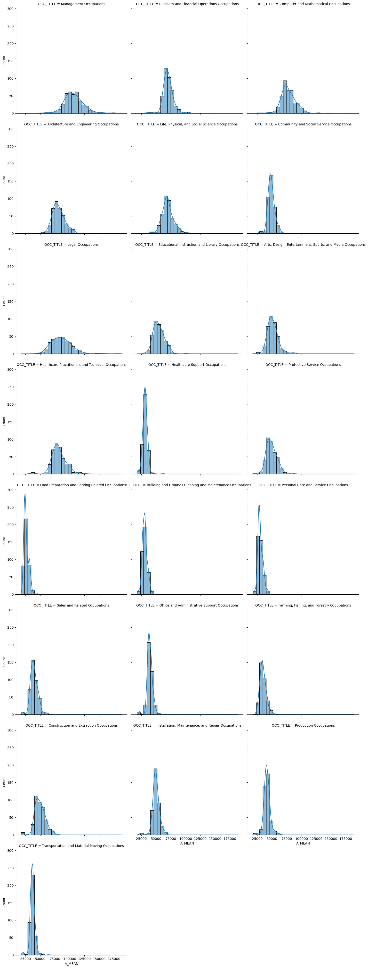
Why TensorFlow Probability?
This is where modern probabilistic programming enters the picture. TensorFlow Probability provides a flexible, Pythonic way to build hierarchical Bayesian models that can borrow strength across related groups. Unlike specialized tools like Stan or JAGS that require learning new syntax and compilation steps, TensorFlow Probability integrates seamlessly with the Python data science stack. It leverages automatic differentiation for efficient sampling, scales naturally to large datasets, and can even run on GPUs when dealing with massive hierarchical structures. For practitioners already working in Python with pandas and NumPy, it’s a natural extension rather than a completely new toolchain.
The Fay-Herriot model we’ll implement recognizes that “Chief Executives in Dallas” shares information with both “Chief Executives in Houston” (same occupation, different city) and “Human Resource Managers in Dallas” (same city, different management occupation). By partially pooling across these related groups, we can stabilize those noisy estimates while still preserving real differences where the data supports them. The model automatically learns how much to trust each direct estimate versus the group average, delivering wage estimates that are both more accurate and more honest about their remaining uncertainty.
# pick one major occupation group for illustration
# Management Occupations have a large gap between the detailed quantiles and the major ones.
group = "Management Occupations"
sub = det[det['MAJOR_OCC'] == group].dropna(subset=['A_MEAN','MEAN_PRSE'])

# extract direct estimates and their SEs
dir_est = sub['A_MEAN'].values.astype('float32')
dir_se = (sub['A_MEAN'] * sub['MEAN_PRSE'] / 100).values.astype('float32')
M = len(dir_est)

# Transform to log scale (delta method)
log_dir_est = np.log(dir_est)
log_dir_se = dir_se / dir_est
Here we construct a simple Fay-Herriot Model using 3 distributions based on three parameters.
# Define the Fay-Herriot model
def joint_log_prob_fn(theta, mu, log_sigma2):

    # Transform log_sigma2 back to sigma2
    sigma2 = tf.exp(log_sigma2)
    sigma = tf.sqrt(sigma2)

    # Prior for mu: weakly informative centered around log(50000)
    mu_prior = tfd.Normal(loc=tf.math.log(50000.0), scale=50.)

    # Prior for sigma2: uninformative inverse gamma
    # We use log_sigma2 with a change of variables
    # InverseGamma(α, β) for sigma2 is equivalent to
    # -Gamma(α, β) for log(sigma2) plus Jacobian
    sigma2_prior = tfd.InverseGamma(concentration=2.0, scale=0.02)

    # Likelihood at sampling level
    # dir_est[j] ~ Normal(theta[j], dir_se[j])
    sampling_dist = tfd.Normal(loc=theta, scale=log_dir_se)

    # Smoothing level (hierarchical prior)
    # theta[j] ~ Normal(mu, sigma)
    smoothing_dist = tfd.Normal(loc=mu, scale=sigma)

    # Calculate joint log probability
    lp = tf.reduce_sum(sampling_dist.log_prob(log_dir_est))
    lp += tf.reduce_sum(smoothing_dist.log_prob(theta))
    lp += mu_prior.log_prob(mu)
    lp += sigma2_prior.log_prob(sigma2)
    lp += log_sigma2  # Jacobian for log transform
    return lp
# Set up HMC sampler
num_warmup_steps = 1000
num_results = 5000
# Initial values
initial_theta = log_dir_est + np.random.normal(0, 0.1, size=M).astype(np.float32)
initial_mu = np.float32(np.log(50000))
initial_log_sigma2 = np.float32(np.log(0.1))
# Define the kernel
num_adaptation_steps = int(num_warmup_steps * 0.8)@tf.function
def run_chain():
# Use No-U-Turn Sampler (NUTS) for better performance
kernel = tfp.mcmc.NoUTurnSampler(
target_log_prob_fn=joint_log_prob_fn,
step_size=0.01,
)
# Add adaptation for step size
kernel = tfp.mcmc.DualAveragingStepSizeAdaptation(
inner_kernel=kernel,
num_adaptation_steps=num_adaptation_steps,
target_accept_prob=0.8
)
# Run the chain
samples, kernel_results = tfp.mcmc.sample_chain(
num_results=num_results,
num_burnin_steps=num_warmup_steps,
current_state=[initial_theta, initial_mu, initial_log_sigma2],
kernel=kernel,
trace_fn=lambda _, pkr: pkr.inner_results.is_accepted
)
return samples, kernel_results# Run the chain - this one takes the time.
samples, is_accepted = run_chain()
theta_samples, mu_samples, log_sigma2_samples = samples# Calculate results
acceptance_rate = tf.reduce_mean(tf.cast(is_accepted, tf.float32))
# Convert to numpy arrays
theta_samples_np = theta_samples.numpy()
mu_samples_np = mu_samples.numpy()
sigma2_samples_np = np.exp(log_sigma2_samples.numpy())
# Calculate posterior means and standard deviations for each domain
# Transform back to original scale
theta_posterior_mean = np.exp(np.mean(theta_samples_np, axis=0))
theta_posterior_sd = np.std(np.exp(theta_samples_np), axis=0)
# Calculate shrinkage factors (how much each estimate is pulled toward the mean)
shrinkage = 1 - (theta_posterior_sd**2 / dir_se**2)
results = {
'theta_samples': np.exp(theta_samples_np), # On original scale
'theta_log_samples': theta_samples_np, # On log scale
'mu_samples': np.exp(mu_samples_np), # On original scale
'sigma2_samples': sigma2_samples_np,
'posterior_mean': theta_posterior_mean,
'posterior_sd': theta_posterior_sd,
'shrinkage': shrinkage,
'acceptance_rate': acceptance_rate.numpy(),
'direct_estimates': dir_est,
'direct_se': dir_se
}Model Performance: Preserving Signal While Reducing Noise
Before anything else we first need to check our result: the Fay-Herriot model needs to preserve the overall wage distribution. The histograms of direct estimates, Fay-Herriot estimates, and major group estimates all follow nearly identical shapes. The model isn’t artificially compressing wages toward a single value or distorting the natural variation across occupation-location pairs. This is crucial for policy applications—we haven’t traded accuracy for precision by forcing everything toward the middle. The wage landscape remains intact, with high-wage and low-wage occupation-location combinations maintaining their relative positions.
plt.figure(figsize=(8,5))
_,bins,_ = plt.hist(dir_est, bins=40, density=True, histtype='step',linewidth=3,color='black',label='direct estimate')
sns.histplot(results['posterior_mean'], bins=bins, kde=True, color='blue', alpha=0.6,
             stat='density',label='FH estimate')
plt.hist(major[major["OCC_TITLE"]=="Management Occupations"].A_MEAN,bins=bins, density=True,
         histtype='step',linewidth=3,color='purple',label="national estimate")
plt.axvline(results['mu_samples'].mean(), color='black', linestyle='--', label='Posterior mean')
plt.xlabel("Wage estimate")
plt.title(f"Distribution of Fay–Herriot posterior means\n{group}")
plt.legend()
plt.tight_layout()
plt.show()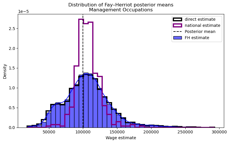
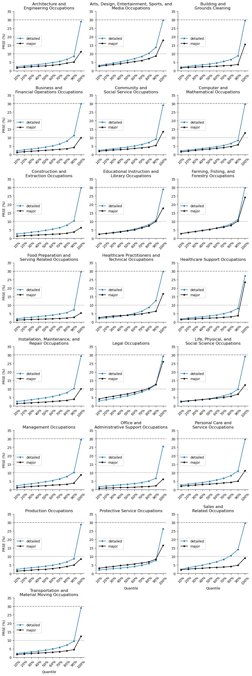
Then we can look into the real reason why we did this. While the wage distributions remain similar, the precision improves towards the major estiamte. The quantile plot shows that detailed occupation PRSEs (our uncertainty measure) have shifted downward after applying the Fay-Herriot model. The 90th percentile of errors drops from near the 30% cut off to just above 20%. These aren’t marginal improvements—they represent substantially tighter confidence intervals that transform marginally useful estimates into actionable intelligence. We see the detailed estimates approaching the precision of the major group estimates, effectively getting the best of both worlds: granular occupational detail with major-group-like reliability. The model has successfully borrowed strength across related domains without destroying the heterogeneity that makes detailed estimates valuable in the first place.
# posterior SD per detailed occupation (use axis=0 across draws)
theta_sd = results["posterior_sd"]
fh_prse = 100 * theta_sd / (results["posterior_mean"] + 1e-12)               # posterior SD relative to posterior mean

# direct PRSE from the data (already percent)
direct_prse = sub['MEAN_PRSE'].to_numpy()

# quantiles including the max (0.1 ... 1.0)
qs = np.linspace(0.1, 1.0, 10)
direct_q = np.quantile(direct_prse, qs)
fh_q     = np.quantile(fh_prse, qs)
major_q = major[major['OCC_TITLE']=="Management Occupations"]['MEAN_PRSE'].quantile(qs)

# plot
plt.figure(figsize=(7,5))
plt.plot(qs, direct_q, marker='o', label='direct PRSE')
plt.plot(qs, fh_q, marker='o', label='FH posterior PRSE')
plt.plot(qs, major_q, marker='o', label='major PRSE')
plt.axhline(30, ls='--', color='gray', label='30% cutoff')
plt.ylim(0, max(35, direct_q.max()*1.05, fh_q.max()*1.05))
plt.gca().xaxis.set_major_formatter(ticker.PercentFormatter(xmax=1))
plt.gca().xaxis.set_major_locator(ticker.MultipleLocator(0.1))
plt.xlabel('Quantile')
plt.ylabel('PRSE (%)')
plt.title(f'PRSE deciles — direct vs FH (group: {group})')
plt.legend()
plt.grid(alpha=0.15)
plt.tight_layout()
plt.show()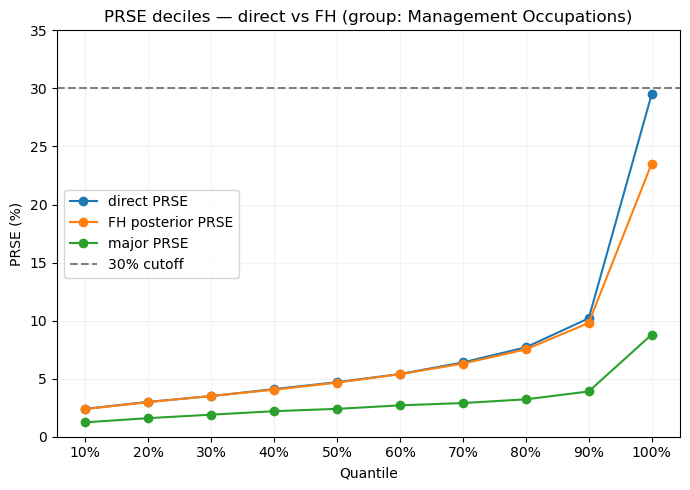
Understanding Shrinkage: The Statistical Art of Skepticism
So let’s now dissect for a moment how the Fay-Herriot model transforms each estimate. Adaptive shrinkage represents a philosophical stance about small-sample inference. When we see a tiny town reporting that its five surveyed managers earn \$200,000 on average, the model essentially says: “That’s possible, but given that most managers earn around \$90,000 and you only surveyed five people, I’m betting your true average is closer to $120,000.” It’s automated skepticism, calibrated by data. The approach follows the empirical Bayes tradition pioneered by Bradley Efron and Carl Morris in their famous baseball batting average studies—extreme performances usually regress toward the mean because they’re partially luck. The Fay-Herriot model simply formalizes this intuition into an optimal mathematical framework, ensuring our skepticism is neither too harsh nor too lenient, but just right for the uncertainty we face.
def plot_results(results, occupation_names=None, highlight_indices=None):
    """
    Create diagnostic plots for the Fay-Herriot model results.
    """
    fig, axes = plt.subplots(2, 2, figsize=(12, 10))

    # Plot 1: Direct estimates vs Posterior means
    ax = axes[0, 0]
    ax.scatter(results['direct_estimates'], results['posterior_mean'], alpha=0.5)
    ax.plot([results['direct_estimates'].min(), results['direct_estimates'].max()],
            [results['direct_estimates'].min(), results['direct_estimates'].max()],
            'r--', label='y=x')

    if highlight_indices:
        for idx in highlight_indices:
            ax.scatter(results['direct_estimates'][idx],
                      results['posterior_mean'][idx],
                      color='red', s=100, marker='*')
            if occupation_names:
                ax.annotate(occupation_names[idx][:20],
                           (results['direct_estimates'][idx],
                            results['posterior_mean'][idx]),
                           fontsize=8)

    ax.set_xlabel('Direct Estimate ($)')
    ax.set_ylabel('Posterior Mean ($)')
    ax.set_title('Shrinkage Effect: Direct vs Model Estimates')
    ax.legend()

    # Plot 2: Shrinkage by standard error
    ax = axes[0, 1]
    ax.scatter(results['direct_se'] / results['direct_estimates'],
              results['shrinkage'], alpha=0.5)
    ax.set_xlabel('Coefficient of Variation (Direct Estimate)')
    ax.set_ylabel('Shrinkage Factor')
    ax.set_title('Shrinkage vs Uncertainty in Direct Estimate')
    ax.axhline(y=0, color='k', linestyle='-', alpha=0.3)
    ax.axhline(y=1, color='k', linestyle='-', alpha=0.3)

    # Plot 3: Posterior distribution of mu (overall mean on log scale)
    ax = axes[1, 0]
    ax.hist(results['mu_samples'], bins=50, density=True, alpha=0.7, edgecolor='black')
    ax.axvline(results['mu_samples'].mean(), color='red', linestyle='--',
              label=f'Mean: ${results["mu_samples"].mean():,.0f}')
    ax.set_xlabel('Overall Mean Wage ($)')
    ax.set_ylabel('Density')
    ax.set_title('Posterior Distribution of μ (Population Mean)')
    ax.legend()

    # Plot 4: Posterior distribution of sigma2
    ax = axes[1, 1]
    ax.hist(np.sqrt(results['sigma2_samples']), bins=50, density=True, alpha=0.7, edgecolor='black')
    ax.axvline(np.sqrt(results['sigma2_samples']).mean(), color='red', linestyle='--',
              label=f'Mean: {np.sqrt(results["sigma2_samples"]).mean():.3f}')
    ax.set_xlabel('σ (Between-Domain SD on log scale)')
    ax.set_ylabel('Density')
    ax.set_title('Posterior Distribution of σ')
    ax.legend()

    plt.tight_layout()
    plt.show()

return figplot_results(results);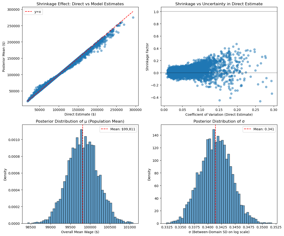
The upper-left scatter plot is perhaps the most important: each point represents one occupation-location combination, with its direct estimate on the x-axis and the model’s posterior estimate on the y-axis. If the model did nothing, all points would fall on the red diagonal line. Instead, we see a subtle but systematic pulling toward the center—extreme values get reined in while moderate estimates barely move. The points highlighted in red experienced the strongest shrinkage, typically those with the highest uncertainty in their original estimates.
The upper-right panel reveals the mechanism: shrinkage intensity directly correlates with the coefficient of variation (relative uncertainty) of the direct estimate. Domains with CVs above 15% might experience 30-40% shrinkage, while those with CVs below 5% barely shrink at all. This isn’t arbitrary—it emerges from the optimal weighting formula we discussed earlier. The model has learned to be deeply skeptical of extreme claims from tiny samples while trusting stable estimates from well-sampled domains.
The bottom panels show what the model has learned about the population structure. The posterior distribution of μ (the overall mean wage on log scale) is tight and well-defined, giving us high confidence in the central tendency across all occupation-location pairs. The posterior of σ tells us about genuine heterogeneity—how much real variation exists versus sampling noise. A larger σ means more true differences between domains, leading to less aggressive shrinkage. As Schneider notes in the original blog post, this σ parameter is crucial: if it collapses to near zero, the model believes all variation is noise and shrinks everything to the global mean. If it’s large, the model preserves most of the direct estimates. The data itself determines this balance.
Measuring Public Opinion: Immigration Attitudes Across Dutch Regions
The European Social Survey (ESS) represents one of social science’s most ambitious attempts to track attitudes and beliefs across Europe. Conducted every two years since 2002, it uses rigorous probability sampling and standardized questions to enable both cross-national and within-country comparisons. For our analysis, we focus on one particularly policy-relevant question from the Netherlands data: “Would you say that [country]’s cultural life is generally undermined or enriched by people coming to live here from other countries?” Respondents answer on an 11-point scale from 0 (“Cultural life undermined”) to 10 (“Cultural life enriched”), capturing a nuanced view of how citizens perceive immigration’s cultural impact—a central issue in contemporary Dutch and European politics.
# Load the ESS Round 10 data (assuming the file is in the current directory)
ess = pd.read_csv('ESS7e02_3.csv')

# Filter for the Netherlands
ess_nl = ess[ess['cntry'] == 'NL']

# Select relevant columns: region code and attitude score
data_nl = ess_nl[['region', 'imueclt']].copy()

# Drop missing or invalid values of the attitude question if any
data_nl = data_nl.dropna(subset=['imueclt'])
data_nl = data_nl[data_nl.imueclt<11] # codes 66,77,88,99 are NA/refuse to answer/don't know/no answer.

print(f"Total Dutch respondents in ESS Round 7: {len(data_nl)}")
print(f"a few example entries")
data_nl.head(10)
Total Dutch respondents in ESS Round 7: 1884
a few example entries/var/folders/3w/jcz46dj964526sk_kgkg8p0r0000gn/T/ipykernel_10121/3408254060.py:2: DtypeWarning: Columns (161) have mixed types. Specify dtype option on import or set low_memory=False.
ess = pd.read_csv('ESS7e02_3.csv')| region | imueclt | |
|---|---|---|
| 30935 | NL41 | 8 |
| 30936 | NL41 | 5 |
| 30937 | NL41 | 8 |
| 30938 | NL41 | 10 |
| 30939 | NL41 | 8 |
| 30940 | NL41 | 5 |
| 30941 | NL41 | 7 |
| 30942 | NL41 | 7 |
| 30943 | NL41 | 2 |
| 30944 | NL41 | 8 |
# Choose within-country analysis weight; fallback to design*post-strat; else uniform
if 'anweight' in ess_nl and ess_nl['anweight'].notna().any():
    print("anweight - using recommended analysis weight")
    w = pd.to_numeric(ess_nl['anweight'], errors='coerce').fillna(0.0)
elif {'dweight','pspwght'}.issubset(ess_nl.columns):
    print("dps")
    w = pd.to_numeric(ess_nl['dweight'], errors='coerce').fillna(0.0) * \
        pd.to_numeric(ess_nl['pspwght'], errors='coerce').fillna(0.0)
else:
    w = pd.Series(1.0, index=ess_nl.index)
data_nl['w'] = w
anweight - using recommended analysis weight# Weighted group stats with Kish n_eff for SE of the mean
def wstats(g):
x = g['imueclt'].to_numpy(dtype=float)
w = g['w'].to_numpy(dtype=float)
wsum = w.sum()
if wsum <= 0:
return pd.Series({'mean': np.nan, 'n': len(g), 'std_dev': np.nan, 'se': np.nan})
m = np.average(x, weights=w)
var_w = np.average((x - m)**2, weights=w) # weighted (population) variance
sd = np.sqrt(var_w)
n_eff = (wsum**2) / np.square(w).sum() # Kish effective n
se = sd / np.sqrt(n_eff) if n_eff > 0 else np.nan
return pd.Series({'mean': m, 'n': len(g), 'std_dev': sd, 'se': se})
provincial = data_nl.groupby('region', sort=True).apply(wstats).reset_index().set_index('region')
national = wstats(data_nl)/var/folders/3w/jcz46dj964526sk_kgkg8p0r0000gn/T/ipykernel_10121/765835511.py:15: DeprecationWarning: DataFrameGroupBy.apply operated on the grouping columns. This behavior is deprecated, and in a future version of pandas the grouping columns will be excluded from the operation. Either pass `include_groups=False` to exclude the groupings or explicitly select the grouping columns after groupby to silence this warning.
provincial = data_nl.groupby('region', sort=True).apply(wstats).reset_index().set_index('region')Mapping Attitudes: The Geographic Distribution
The choropleth map provides our first glimpse into how immigration attitudes vary across the Netherlands’ twelve provinces. Each region’s shading represents its average score on the cultural enrichment question, with darker blues indicating more positive attitudes toward immigration’s cultural impact. This geographic visualization immediately reveals patterns that tables of numbers would obscure: urban provinces like North and South Holland (containing Amsterdam and Rotterdam) might show different patterns than rural Friesland or Zeeland. The map transforms abstract survey responses into a geographic narrative about how different parts of the country view cultural change. However, these regional averages come with a critical caveat—some provinces have hundreds of survey respondents while others have just dozens, making their estimates unreliable for policy planning or academic analysis.
# plot histogram of Utrecht responses...
# “Using this card, would you say that [country]’s cultural life is generally undermined or enriched by people coming to live here from other countries?”
plt.hist(data_nl[data_nl.region=='NL31'].imueclt, weights=data_nl[data_nl.region=='NL31'].w ,bins=range(11))
plt.title("Attitude toward immigrants (0=undermines, 10=enriches) in provincie Utrecht");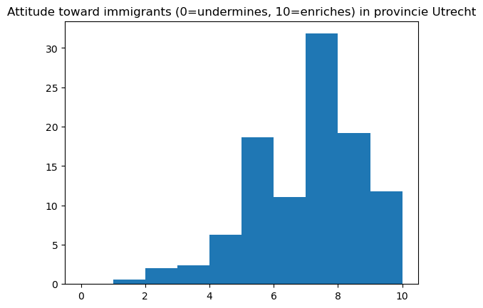
# Eurostat GISCO NUTS2 boundaries (EPSG:4326). Filter to NL and join on NUTS_ID.
nuts2_url = "https://gisco-services.ec.europa.eu/distribution/v2/nuts/geojson/NUTS_RG_01M_2021_4326_LEVL_2.geojson"
gdf = gpd.read_file(nuts2_url)
nuts2_nl = gdf[gdf['CNTR_CODE'] == 'NL']

# Merge the direct estimates with the GeoDataFrame on region code
# In the shapefile, NUTS_ID contains the region codes (e.g., "NL11", "NL12", ...)
map_direct = nuts2_nl.merge(provincial.reset_index(), left_on='NUTS_ID', right_on='region')

# Plot the map of direct means
fig, ax = plt.subplots(figsize=(6,6))
map_direct.plot(column='mean', ax=ax, cmap='Blues', edgecolor='black', legend=True)
ax.set_title('Direct Survey Mean of Attitude (imueclt) by Province', fontsize=12)
ax.axis('off')
plt.show()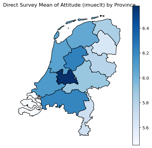
prov_plot = map_direct.sort_values("mean")
y = np.arange(len(prov_plot))
x = prov_plot["mean"].to_numpy()
xe = 1.96*prov_plot["se"].to_numpy()

plt.figure(figsize=(8,5))
plt.errorbar(x, y, xerr=xe, fmt="o", capsize=3)
plt.axvline(national["mean"], linestyle="--")
plt.yticks(y, prov_plot["NUTS_NAME"])
plt.xlabel("imueclt (0 = undermines, 10 = enriches)")
plt.title("Province means with 95% CIs (ESS Round 7, NL)")
plt.tight_layout()
plt.xlim(4.5,7.5)
plt.show()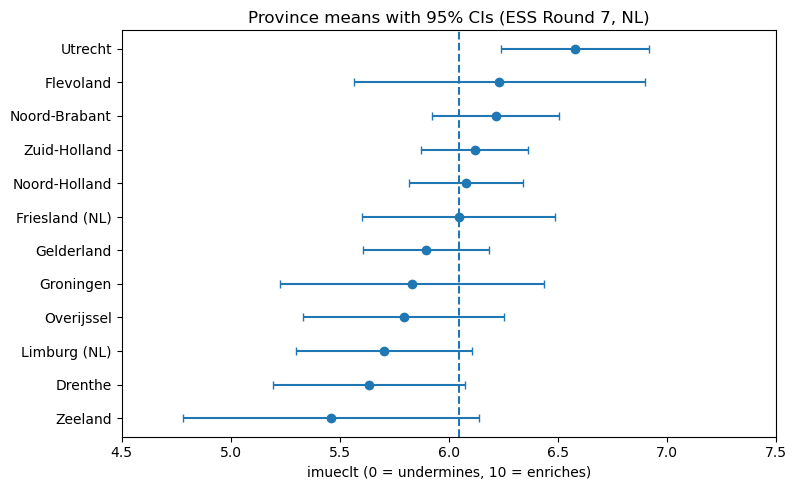
The Uncertainty Challenge: When Regions Have Few Voices
The regional breakdown plot exposes the statistical challenge hiding beneath the map’s clean boundaries. Each province’s estimate comes with error bars reflecting the uncertainty from limited sample sizes. While the ESS employs sophisticated sampling strategies, dividing even a well-designed national sample of 1,500-2,000 respondents across twelve provinces leaves some regions desperately underpowered. Groningen might have just 40 respondents, while South Holland has 300. The direct estimates swing wildly—some provinces appear to love immigration’s cultural impact while others seem hostile, but these differences might simply reflect which particular 40 people happened to answer the survey. The national average (shown as a dashed line) provides a stable reference point, but using it for every province would erase genuine regional variation in attitudes that policymakers need to understand.
Why Regional Opinion Estimates Matter
Getting accurate regional attitude estimates isn’t just an academic exercise—it’s essential for democratic governance and evidence-based policy. National governments need to understand how immigration policies play differently in Amsterdam versus rural Drenthe. Local officials need to know whether their constituents’ views align with or diverge from national trends. Media organizations want to report on regional divides without amplifying statistical noise. But the standard approach of simply reporting survey percentages with margins of error breaks down at the regional level. A province showing 65% support with a ±15% margin of error tells us almost nothing useful.
The Fay-Herriot model offers a principled solution by recognizing that Dutch provinces, while distinct, aren’t isolated planets. Attitudes in Utrecht probably share something with those in neighboring South Holland. Rural provinces might cluster together in their views, distinct from but not completely independent of urban areas. By borrowing strength across regions—pulling unstable estimates toward the national average by just the right amount—we can produce estimates that are both more accurate and more honest about remaining uncertainty. The stabilized estimates still show regional variation where it genuinely exists but no longer mistake small-sample noise for deep cultural divides.
tf.keras.backend.set_floatx('float32')  # keep TF default consistent

y  = provincial['mean'].to_numpy().astype('float32')
se = provincial['se'].to_numpy().astype('float32')
M  = y.shape[0]

def make_model(se_obs):
    return tfd.JointDistributionNamedAutoBatched({
        'mu':    tfd.Normal(loc=tf.constant(0., tf.float32),  scale=tf.constant(10., tf.float32)),
        'tau':   tfd.HalfNormal(scale=tf.constant(1.0, tf.float32)),  # tighter than HalfCauchy(2.5)
        'theta': lambda tau, mu: tfd.Sample(tfd.Normal(loc=mu, scale=tau), sample_shape=[M]),
        'y':     lambda theta: tfd.Independent(tfd.Normal(loc=theta, scale=se_obs), reinterpreted_batch_ndims=1),
    })

jd = make_model(tf.constant(se, dtype=tf.float32))
pinned = jd.experimental_pin(y=tf.constant(y, dtype=tf.float32))
target_log_prob_fn = lambda mu, tau, theta: pinned.log_prob({'mu':mu, 'tau':tau, 'theta':theta})

init = [tf.constant(0., tf.float32), tf.constant(1., tf.float32), tf.constant(y, tf.float32)]
bij  = [tfb.Identity(), tfb.Softplus(), tfb.Identity()]

nuts = tfmcmc.NoUTurnSampler(target_log_prob_fn, step_size=0.3)
nuts = tfmcmc.TransformedTransitionKernel(nuts, bijector=bij)
nuts = tfmcmc.DualAveragingStepSizeAdaptation(nuts, num_adaptation_steps=500)@tf.function(jit_compile=False)
def run():
return tfmcmc.sample_chain(
num_results=2000, num_burnin_steps=1000,
current_state=init, kernel=nuts, trace_fn=lambda *args, **kw: ())samples,_ = run()
mu_s, tau_s, theta_s = samples # shapes: (), (), (draws, M)
theta_mean = tf.reduce_mean(theta_s, axis=0).numpy()
theta_lo = tfp.stats.percentile(theta_s, 2.5, axis=0).numpy()
theta_hi = tfp.stats.percentile(theta_s, 97.5, axis=0).numpy()
provincial['fh_mean'] = theta_mean
provincial['fh_lo'] = theta_lo
provincial['fh_hi'] = theta_himap_direct2 = nuts2_nl.merge(provincial.reset_index(), left_on='NUTS_ID', right_on='region')
# Plot the map of FH means
fig, ax = plt.subplots(figsize=(6,6))
map_direct2.plot(column='fh_mean', ax=ax, cmap='Blues', edgecolor='black', legend=True)
ax.set_title('Fay-Heriot Model of Attitude by Province', fontsize=12)
ax.axis('off')
plt.show()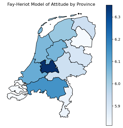
prov_plot = map_direct2.sort_values("fh_mean")
y = np.arange(len(prov_plot))
xfh  = prov_plot["fh_mean"].to_numpy()
xerr_fh = np.vstack([prov_plot["fh_mean"] - prov_plot["fh_lo"],
                     prov_plot["fh_hi"]  - prov_plot["fh_mean"]])

plt.figure(figsize=(8,5))
plt.errorbar(xfh, y, xerr=xerr_fh, fmt="s", capsize=3, label="Fay–Herriot")
plt.legend(loc="lower right")
plt.xlabel("Attitude (direct vs. FH)")

plt.axvline(national["mean"], linestyle="--")
plt.yticks(y, prov_plot["NUTS_NAME"])
plt.title("Province means with 95% CIs (ESS Round 7, NL)")
plt.tight_layout()
plt.xlim(4.5,7.5)
plt.show()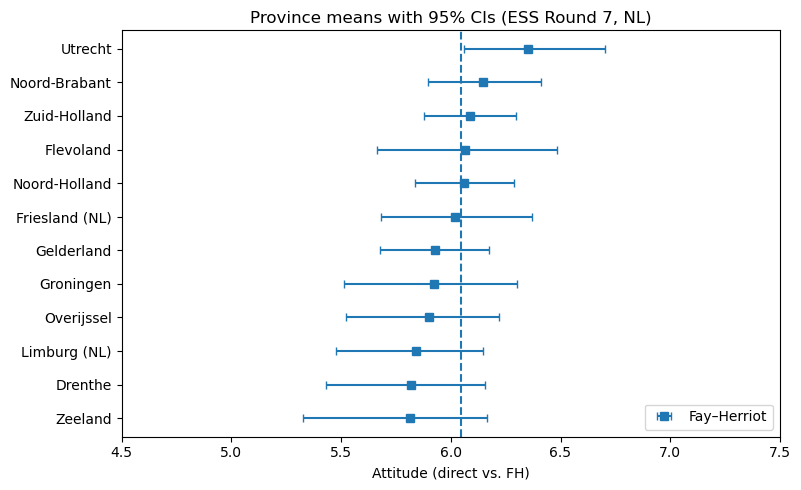
This approach transforms a noisy patchwork of unreliable regional estimates into actionable intelligence about geographic variation in public opinion. Provinces with tiny samples get pulled strongly toward the national average, acknowledging we simply don’t have enough data to say anything precise about that specific region. Provinces with robust samples maintain their distinct estimates, preserving real geographic variation where the evidence supports it. The result is a map that policymakers can actually use—one that shows genuine regional differences without amplifying statistical mirages that disappear with the next survey wave.